
How to Read a Candlestick Chart
Learn how to read a candlestick chart on PLUBIT Exchange. This beginner-friendly guide explains candlestick anatomy, common chart patterns, market trends, and how candlestick charts help traders make informed trading decisions.
By plubit support · August 5, 2026
Main Takeaways
- Every candlestick displays the Open, High, Low, and Close prices.
- Green candles generally represent buying pressure.
- Red candles generally represent selling pressure.
- Different timeframes provide different perspectives on market activity.
- Candlestick charts should be used alongside other technical analysis tools.
Candlestick charts are one of the most widely used tools in cryptocurrency trading. They provide a visual representation of price movements over a specific period, helping traders understand market sentiment and identify potential trading opportunities.
Whether you're buying Bitcoin for the first time or analyzing market trends, understanding how to read a candlestick chart is an essential trading skill.
In this guide, you'll learn the basics of candlestick charts, understand what each candle represents, and discover how to interpret price movements on PLUBIT Exchange.
What Is a Candlestick Chart?
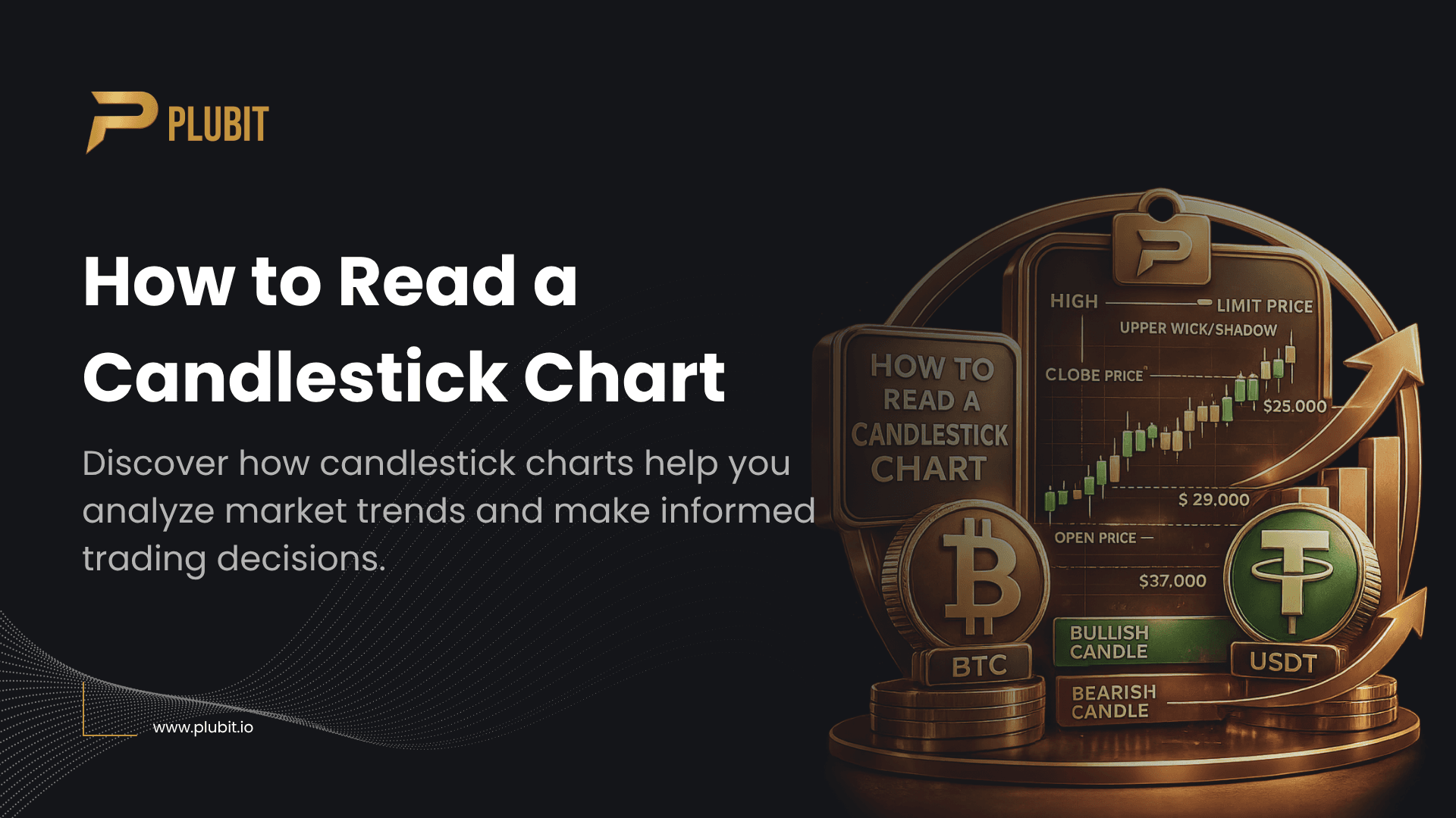
A candlestick chart is a graphical representation of an asset's price movement over a selected time period.
Each candlestick shows four important price points:
- Open Price
- Close Price
- Highest Price (High)
- Lowest Price (Low)
By analyzing these values, traders can better understand market behavior and identify whether buyers or sellers are currently in control.
Understanding Candlestick Anatomy
Each candlestick consists of two main parts:
Body
The body represents the difference between the opening price and the closing price.
A long body generally indicates stronger buying or selling activity, while a short body suggests relatively little price movement during that period.
Wicks (Shadows)
The thin lines extending above and below the body are called wicks or shadows.
They represent:
- The highest price reached during the selected period.
- The lowest price reached during the selected period.
Long wicks often indicate price rejection or increased market volatility.
Bullish vs Bearish Candlesticks
Candlesticks can indicate whether the market moved higher or lower during the selected timeframe.
Bullish Candlestick
A bullish candle forms when the closing price is higher than the opening price.
This indicates that buyers were stronger than sellers during that period.
Bullish candles are commonly displayed in green.
Bearish Candlestick
A bearish candle forms when the closing price is lower than the opening price.
This indicates that sellers had greater control during that period.
Bearish candles are commonly displayed in red.
Understanding Timeframes
Each candlestick represents price activity over a specific period.
Common chart intervals include:
- 1 Minute (1m)
- 5 Minutes (5m)
- 15 Minutes (15m)
- 1 Hour (1H)
- 4 Hours (4H)
- 1 Day (1D)
- 1 Week (1W)
For example:
A 1 Hour chart means each candlestick represents one hour of trading activity.
Longer timeframes generally provide a broader view of market trends, while shorter timeframes show more detailed price movements.
Identifying Market Trends
Candlestick charts can help identify the overall market direction.
Uptrend
An uptrend occurs when prices consistently form higher highs and higher lows.
This suggests buyers are controlling the market.
Downtrend
A downtrend occurs when prices consistently form lower highs and lower lows.
This indicates stronger selling pressure.
Sideways Market
Sometimes prices move within a relatively narrow range without establishing a clear trend.
This is known as a sideways or ranging market.
Common Candlestick Patterns
While there are many candlestick patterns, beginners should first become familiar with these common formations.
Doji
A Doji forms when the opening and closing prices are nearly identical.
It often indicates market indecision between buyers and sellers.
Hammer
A Hammer has a small body with a long lower wick.
It may signal a potential bullish reversal after a downtrend.
Shooting Star
A Shooting Star has a small body with a long upper wick.
It may indicate a potential bearish reversal after an uptrend.
Engulfing Pattern
An Engulfing pattern occurs when one candlestick completely covers the body of the previous candle.
It may signal a strong change in market momentum.
Why Candlestick Charts Matter
Understanding candlestick charts can help traders:
- Analyze market sentiment.
- Identify potential entry and exit points.
- Recognize market trends.
- Improve trading decisions.
- Better understand price behavior.
Although candlestick charts provide valuable information, they should not be used as the only basis for making trading decisions.
Tips for Beginners
If you're new to technical analysis:
- Start by learning basic candlestick structures.
- Focus on longer timeframes before using shorter intervals.
- Combine candlestick analysis with support and resistance levels.
- Avoid making decisions based on a single candlestick.
- Practice analyzing charts before placing larger trades.
Frequently Asked Questions (FAQ)
1. What does a green candlestick mean?
A green candlestick generally indicates that the closing price was higher than the opening price, suggesting buying pressure.
2. What does a red candlestick mean?
A red candlestick indicates that the closing price was lower than the opening price, suggesting selling pressure.
3. Which timeframe is best for beginners?
Many beginners prefer using 1 Hour (1H) or 4 Hour (4H) charts because they provide a clearer view of overall market trends.
4. Can candlestick patterns predict future prices?
No.
Candlestick patterns provide insights into historical price behavior and market sentiment, but they do not guarantee future market movements.
5. Should I rely only on candlestick charts?
No.
Successful traders often combine candlestick analysis with other tools such as trend lines, support and resistance, trading volume, and risk management.
Common Issues
IssueSolution
Chart looks confusing
Start with longer timeframes like 1H or 4H.
Misinterpreting patterns
Learn the basic candlestick structures before studying advanced patterns.
Trading based on one candle
Always analyze the broader market trend.
Switching timeframes too often
Focus on one or two preferred timeframes.
Ignoring risk management
Always use proper position sizing and risk management strategies.
Final Thoughts
Candlestick charts are one of the most valuable tools for understanding cryptocurrency markets. By learning how each candlestick represents price movement, recognizing common patterns, and identifying market trends, you can make more informed trading decisions.
While candlestick analysis is an important skill, it works best when combined with other technical analysis tools and sound risk management practices.